Video Resumes: Directed by Sergio Leone

The Clint Eastwood: A video resume allows potential employers to get a better idea of your personality and demeanor right off the bat, which they normally don’t get until an interview. The fact that video resumes are unusual means that they also grab the employer’s attention so you stand out in their mind.

The Lee Van Cleef: At least, you’ll stand out if they bother to watch it. The fact that video resumes aren’t a common thing is a double-edged sword—many people won’t bother with them and will just dive into the hefty stack of traditional paper resumes sitting on their desk instead. It’s presumably worked well enough for them so far, so why should they bother with this new thing they’re not used to? They might sort through several traditional resumes in the time it takes to watch your video resume, so unless you’re a very damned impressive candidate, they’re likely to find it a waste of their time.

The Eli Wallach: Besides, how practical is it to send in just a video resume? The resume is an important part of the interview (assuming you manage to land one with your video resume), and both you and the interviewer will need to refer back to it during the interview. Nobody’s going to spend the interview trying to find that bit of the video where you said something they wanted to ask you about, so at the interview you’re going to end up having either a transcript of the video or a paper resume with you, both of which would sort of defeat the point of spending time making the video in the first place. Just send them a paper resume like a civilized human being. Otherwise it’s just going to be a mess.

On Fonts

I’ve always been a big fan of just using whatever default font your word processor uses, because that’s what works for almost everybody in almost everything they write. So I don’t vary my font choices much; personal or professional, 99% of the time I get by with Times New Roman, 12pt font. No complaints so far. If I really have a mind to change things up, I’ll follow the book’s advice and just use a sans serif font for the headlines, and a serif font (usually Times New Roman) for the body copy. Beyond that, I really never need to change up the font, because most of what I write just needs to be easy to read—no bells and whistles necessary. Unless you’re designing a flier or pamphlet or something, nobody should notice your choice of fonts. The font isn’t supposed to matter. The important part is what the damn thing says.

Some say that 12pt Times New Roman is boring. I suspect that those people just don’t like reading and are making excuses.

Rhetoric on the Town: Flow

An in-universe ad for Sunset Sarsaparilla from Fallout: New Vegas. Left is the original poster, and right is the faded, 200-year-old remnant.

This is an ad for a fictional brand that appears in Fallout: New Vegas. Its purpose in the video game is for atmosphere—to create a sense of what the world was like before the Great War of 2077. That purpose has little to do with the concept of flow, however, so instead I will focus on the poster’s in-universe purpose: to sell sarsaparilla. The poster flows in a sort of Z shape, starting with the bodybuilder and moving to the upper right corner, then down to the left and across the brand name at the bottom.

The focal point of the image is the bodybuilder, but the barbell and the right arm point up and to the right, leading the eye up toward the bottle he’s holding. The stripes on his shirt reinforce this, as does the bodybuilder’s orientation. Once the eye is on the bottle, the words “Build Mass with SASS!” are very close, making them the next thing the reader looks at. From the words, the bodybuilder’s head and neckline point down and to the left, toward the brand name at the bottom. The ad starts with the recognizable bottle, continues with a slogan and picture that entice the reader to buy the product, and ends with the brand name, ensuring that the name Sunset Sarsaparilla sticks in the reader’s mind, making them more likely to buy the drink.

Project 3 Activity 2

I have accounts with Facebook, Reddit, Google, Skype, and Youtube. Of these, only Facebook, Skype and Google are associated with any part of my name. Partly because of privacy concerns, but mostly because I don’t use the others socially and therefore don’t have any reason to have my name put on them.

Google didn’t find me within 10 pages, but Bing and Yahoo both got my Facebook on page 1. Other than that I didn’t get anything at all, which is exactly what I expected. If someone were Facebook friends with me, they could conceivably find the username I use for most of my other accounts (which is pretty unique and finds those accounts immediately), but other than that I would appear to be relatively anonymous. This pleases me—I don’t like the idea of anyone and everyone being able to find out everything I do online, even if it is all boring crap that no one cares about. I don’t have anything to hide, per se, but I very much like having the option to hide it. And if anyone were to go to enough trouble that they could find me, they’re probably knowledgeable enough that I couldn’t do anything to stop them anyway, short of completely leaving the internet and moving to a new city.

Project 3 activity 1

When I grow up, I want to be a game designer. Even if I can’t do it professionally, it’s something I’d like to do in my spare time. I’ve always loved playing video games, and as I got older I got interested in what makes them work, how they’re put together, and what makes them fun. It started out with the naïve idea that video game testing would be the best job in the whole world, but eventually moved to an interest in the development and design aspects. I particularly remember playing Pokémon Yellow Version for the first time and just losing myself in it for hours and hours at a time, and I want to create that kind of experience for other people.

Several years ago now, my dad signed me up for a week-long summer program for kids wherein we were divided into groups to create a coherent idea for a video game, and pitched our idea to some industry professionals at the end of the week. The collaborative process was enlightening and fascinating, and we came up with a pretty good idea in the end. I later learned that one of the most important skills for a game designer is writing, and fortunately I turned out to be pretty good at that. I’ve developed my writing skills in most of my classes over the years, and particularly in college courses. I even wrote a full game design document for a project one semester. Recently, I’ve been working on developing some programming skills so that I can work more intimately with game engines and create my own games more easily.

Rhetoric on the Town: Alignment

The tag skill selection menu, part of character creation in Fallout: New Vegas

This image, a menu, is part of the user interface (UI) for a video game, so it has to do a few things. First, it must make its purpose clear; this menu is for choosing “tag skills,” which in this game provide starting bonuses to those skills. Because these choices are permanent once confirmed, the menu must also make it clear what each skill does so the player knows what they are choosing. Most importantly, this menu must be easy to read and understand, because many gamers may be put off by confusing menu screens and end up not playing the game.

To accomplish this, the designers used alignment to create a grid, onto which almost all of the elements fall perfectly. The top and bottom, including the border, inform the player what the menu is for: selecting three skills to tag. It’s not pictured here, but once a skill is selected, it gets highlighted and the number next to it is boosted by 15 points, which lets the player easily keep track of which skills they’ve selected and shows the effect of tagging a skill. On the left we have a left-justified list of skills in one column, and a right-justified list of values associated with the skills. This column is also aligned with the “SKILLS: 0/3 Selected” text, which creates a visual break between the skills list on the left and the description on the right. The description is further broken into two elements, separated by the line: on the top is a picture related to the skill (Survival involves cooking at campfires, so the picture reflects this), and below is a brief description of its effect on the game to help the player decide whether or not they want to tag it. The only element that isn’t strictly in alignment is the text on the far right, “Reset R)” and “Done A)”. Placing them outside the menu’s grid draws attention to them, which is useful because they tell the player how to perform two common functions and because the “Done” option is the only way to progress past the menu. The menu looks organized, and separates into distinct, informative elements that make it easy for the player to read it and understand what they’re doing.

Rhetoric on the Town: Contrast

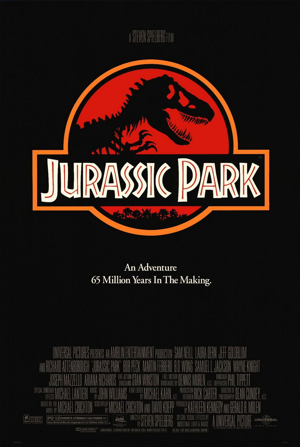
The movie poster for Jurassic Park

Being a movie poster, the obvious purpose of this image is to get people to see Jurassic Park. It’s intended for everybody old enough to see the film, but the poster is particularly aimed at those who have seen the trailer, either on TV or in the theater before some other movie. Since Jurassic Park is based on a book, it also reaches those people who read the book but weren’t aware that there was a movie coming out. So the goal of the poster is really to remind people that they want to see Jurassic Park, rather than entice people who haven’t heard of it. To that end, it focuses on creating a memorable icon—the easier it is to remember, the more likely people are to go see the film.

The poster uses a lot of contrast to create this memorable icon, both in the Jurassic Park logo and overall in the poster. The overall contrast is obvious: the white text and the yellow border stand out against the black background. The yellow also contrasts with the white text, and this along with the fact that the logo is the biggest element on the page makes this the clear focal point. There is also some font contrast here: all the credits are in the same thin, slightly darker font, which makes them easily ignored compared to the rest of the text. This is good because the credits are the least important part of the image. The title and subtitle also have different fonts. The title font looks exotic, hinting at adventure, while the subtitle font looks comparatively normal.

The distinct shape and coloring of the logo make it recognizable even at a distance, making it memorable. Within the logo, the red, yellow, white, and black all contrast with one another, creating distinct elements. The red inside the white lettering keeps the font looking interesting, and makes it the focus of the logo. This ensures that the single most memorable thing about the entire poster is the title of the film. The T-Rex silhouette will also be familiar to fans of the book, and placing it against a red background makes it stand out more than it does on the book cover. This familiar element in an otherwise new logo may help them connect the book to the film and make them more likely to see the film. The logo is also shown at the end of the theatrical trailer, so it brings the trailer to mind for those who have seen it, thus making them more likely to see the film, which is, after all, the point of the poster.

Rhetoric on the Town: Repetition

In-game artwork for the Dark Carnival campaign in Left 4 Dead 2.
Characters left to right: Rochelle, Nick, Coach, and Ellis.

This image isn’t an ad per se; it’s an in-game movie poster for one of Left 4 Dead 2‘s campaigns. This means that the audience is quite specific—it’s targeted at people already playing the game. This image shows up when a player is choosing a campaign to play from the list and during the first loading screen after they choose. The purpose of the image therefore is to encourage the player to pick this campaign, and once they do, to give them a taste of what’s to come and get them in the mood to play. In this case, that’s the carnival, the centerpiece of the campaign, and the clown, a special enemy type from this campaign. Since this is a game about killings lots and lots of zombies, the image should evoke a feeling of fear, but this feeling shouldn’t be too strong because it’s not just a horror game. For lack of a better term, it should look “badass” in order to entice players to pick this campaign.

In this image, repetition is used to form a unified gestalt feeling of mild horror (unless you hate clowns—then it’s probably outright terrifying). The most obvious example of repetition is the lights: lights around the billboard on the left, lights in the letters in the center sign, and lights strung up all over the background. There are also 4 spotlights. The coloring of the letters has some repetition—though different typefaces are used for the words “Dark” and “Carnival,” they’re both red with white outlines. The red/white color scheme is repeated in the background, but faded: it’s along the wall and in the “Eat Burgers” sign on the left, and also in the “Amusement Park” sign in the center. The blue color of the clouds is also repeated in a stuffed animal in the bottom right corner, the grayer blues are repeated in the pavement and in other stuffed animals, and similar blues from the sky are used in Rochelle’s and Ellis’s jeans. There is also repetition in the characters’ poses: Nick and Coach are facing the camera with guns over their shoulders, and Rochelle and Ellis are facing out to the sides. They all have weapons (though Ellis is holding his at his side), and none of them are smiling: it looks slightly scary and very badass, and that makes it seem like a fun campaign to play, which is the image’s purpose to begin with.

Chapter 2: Emphasis

Summary

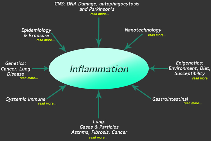
Keeping everything the same is boring.  Some things have to stand out on your page. The most important thing should be the most prominent, the second most important thing slightly less prominent, and so on. What you emphasize depends on what’s most important. Emphasis helps a reader pick out the important parts and makes your page interesting to look at. Techniques include making things big, bold, or bright; adding outlines; and fading things around the emphasized element. Novice designers tend to use emphasis too much when they first learn it, and knowing how much to use is an important part of learning design.

An example of emphasis. Notice that not only is the word “inflammation” the biggest element in the image, but it’s surrounded by arrows pointing to it. All of this draws the eye to the center, making it the focal point.

Key Terms

Visual hierarchy: the arrangement of visual elements according to their importance

Focal point: the most emphasized element on the page, where the reader’s eye goes first


CRAP design

Summary

CRAP is an acronym for Contrast, Repetition, Alignment, and Proximity. Contrast makes things stand out, repetition makes things look consistent, alignment makes things look organized, and proximity keeps things grouped together appropriately. The principles are simple, but their mastery is difficult. Each has its place—for example, you don’t want to use contrast unless you’re deliberately emphasizing or separating something.

Example

Most websites employ the CRAP principles, so I’ll pick the one that destroys most of my free time I’m most familiar with: Reddit. The site uses contrast with the blue hyperlinks, to make them stand out from the rest of the site—after all, that’s why people visit them. This format is kept consistent in most of the site’s individual pages, called subreddits. Next to each link, there is a number in between two arrows, indicating the submission’s score and allowing people to vote on it (provided they’re logged in to an account). Voting on a submission changes the color of the arrows in distinct ways: an upvote is orange, while a downvote is blue. This is more contrast—it helps users quickly identify the way they’ve voted, in case they accidentally click something they didn’t mean to. The link and score indicator together are an example of both repetition and alignment. The repetition is obvious—the setup for every link is the same, with the title, information, and links to comment/save/etc. The alignment comes into play when you look at the left side of the screen: the links and the score indicators are paired so that the score indicator is aligned with the link and its associated information. This also uses proximity: the links are left-aligned and the score indicators are placed right next to them. This, combined with the alignment, lets you know that they are associated with one another.