Rhetoric on the Town: Balance

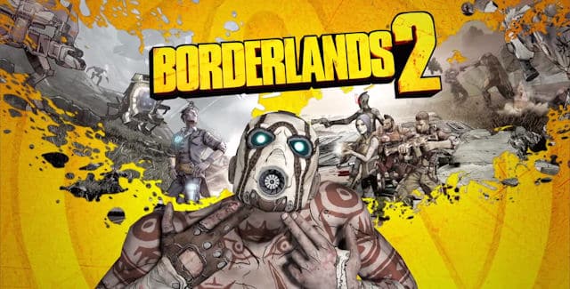
Promotional artwork for Borderlands 2

This image is geared toward gamers, especially fans of the first Borderlands. It appeals to people who like shooters because of the obvious gun imagery. The aim is, of course, to get people to buy Borderlands 2. There is conceptual repetition in this design because it plays on the box art for the first game, with the Psycho using finger guns to shoot himself in the head, and a different image making up the blood spatter. This image, while not perfectly symmetrical, uses symmetrical balance. The iconic Psycho and the title are centered; they’re the ultimate focus as the eye is drawn to the center of the image. A finger gun on each side, blood spatter on each side. Within the blood spatter, the right seems slightly heavier, which places focus on the main playable characters in the game. This interests returning players because they are different characters from the first game.

The whole image says three things: First, that this is a sequel to a popular game, to get you excited if you recognize it; second, that it’s a shooter, to pique your interest if you didn’t play the first one; and third, that this game looks much different from most shooters and has a radically different art direction from the mainstream. The symmetry is mostly playing on the “2” because it’s a sequel, but using two blood spatter images gives a chance to hint vaguely at the story: the folks on the right are fighting the guy on the left. The slight asymmetry in the image—the blood spatter, the slanted text, the Psycho’s tilted head—keep the image from feeling too orderly, which keeps the whole thing interesting. The game comes off as fun and exciting, especially to those familiar with the franchise.

Images!

I haven’t found any I like yet, but I’m thinking of using a picture of a computer surrounded by other digital devices like cameras and phones. What I’ll probably end up doing is using an image of just a computer as a starting point, and editing other devices into that image. I’m planning on using GIMP because it’s a skill I want to develop and because editing multiple images together will probably need a powerful program. And I’m broke.

DW elevator spiel

Have you ever written a blog post? Commented on something? Updated your Facebook status? Taken a picture on your phone? Uploaded a video? Tweeted? Retweeted? Typed a paper? That’s what digital writing is. It’s anything you make that ends up in digital form. In fact, if you used a device like one of these to do it, it probably qualifies.

Chapter 8: Images

Key Terms:

Cropping: Removing part of an image’s edges. Often used to emphasize part of an image or remove unnecessary portions.

Flopping: Flipping an image from side to side, creating a mirror image of the original.

Silhouette: Selectively removing edge portions of an image, but not strictly in straight lines as with cropping.

Illustration: Diagrams, maps, charts, or drawings. Useful for showing complex information, explanation, or decoration as appropriate.

Summary:

Images add impact to a design, and appropriate use of images can make or break a page’s design. Photographs generally seem more credible because we associate them with journalism, and can evoke strong reactions in people. Image editing software allows us to manipulate photographs to better suit designs by cropping, flopping, silhouetting, etc. Illustrations are great for explaining and reinforcing text, but must match the tone of the text in order to be effective. Clip art can be useful, but may have restrictions on how it may be used.  Clip art can also be edited and does not have to be used as-is. Type can also be used as an image, in decorative fonts which can be edited.

Playing With Images:

With modern software, it’s very easy to play around with images, both in page design and in image editing software. There are free tools that allow this kind of play, and a great number of tutorials and guides explaining how to use these tools. This makes it relatively easy to learn how to use images in an experimental environment.

Individual Reflection

Edits to the Wiki:

Minor edits to: CRAP, Flew: New Media as Cultural Technologies, Flew: What’s New About New Media, Collective Intelligence, and The Ethics Challenge

Major edits to: Definitions and Copyright

Links in: OLD/NEW media, Digital Writing and New Media, Flew: What’s New About New Media, Jenkins>Key Terms, Appropriation, Collective Intelligence, Jenkins>Issues, The Ethics Challenge, and Jenkins

I also did a major edit to Jenkins and didn’t realize until I started this post that it never got saved. Oh well.

Reflection:

What are you most proud of in the entire wiki?

I don’t have strong feelings about any of it, but the “Issues” and “Key Terms” pages under Jenkins were pretty good.

What are you most proud of in terms of your contributions to the wiki?

Again, I don’t feel strongly about any of them, but I suppose the internal linking required the most effort.

What do you wish you had time to further expand, include, or revise in the wiki?

One thing I noticed was use of the first person in a few pages, and I tried to rewrite some of that. I would work on that and on creating a more neutral, informative tone similar to Wikipedia. Hopefully in such a way that the internal links would be more robust, as well.

When did you get stuck while working on the wiki? How did you overcome your problem?

Mostly, I just didn’t want to do it. My own apathy has long been my greatest enemy, and I just wasn’t interested in this project at all.How I overcame it is kind of a tough question, as “I just did” presumably won’t suffice. I went through and made a to-do list, and while it didn’t contain everything I could (and probably should) have done, it at least got me to do something.

What did you learn about yourself as a collaborative writer? What collaborative skills do you want to work on in the future?

That I’m maybe a little too timid about editing other people’s writing, though part of that may just be the apathy kicking in again. Once I decided to change something, I didn’t get hung up on the fact that I was changing someone else’s work, I just couldn’t figure out how exactly I wanted to write it, which is always a challenge anyway. In the future I think I need to get more comfortable with the idea of scrapping most of someone’s work and doing it myself.

 Discuss at least four of the course outcomes you feel you worked towards with this assignment. Provide evidence of your learning by pointing to specific aspects of the wiki or your project journal.

It would be hard to come out of this project without making progress on the collaborative problem-solving front. Our in-class meeting in particular was very useful. I tried with limited success to employ the CRAP principles on the pages I edited, particularly repetition in the pages that are essentially lists, by keeping headers and links similar. I did a little bit of play, in that some aspects of this particular wiki software were different enough from other wikis I’ve worked on that I had to figure things out by trial and error. Including a major edit that didn’t get saved, without my noticing. The wiki as a whole is a decent example of collective intelligence, especially considering the week where we all read different things and provided the initial pages for them—that wouldn’t have been done by any of us individually.

Rhetoric on the Town: Bed Bugs and Emphasis

The intended audience for this image is people who have or have had problems with bed bugs, as well as the rest of us who are terrified of having a bed bug problem. The purpose is to instill fear of bed bugs in order to get people to use Orkin’s services. The initial effect is through the (very) emphasized message “bed bugs suck,” with “suck” made of bed bugs for extra emphasis and to make people uncomfortable by thinking about a bunch of bed bugs crawling all over the place in formation. The second most emphasized part of the image is the rather more comforting message “we can help,” which plays on the audience’s fear by offering salvation. All of this draws attention down the image to the box of text, which isn’t emphasized much at all but still stands out and continues creating fear. The red Orkin logo, while small, stands out from the blue on the rest of the image, drawing attention to it.