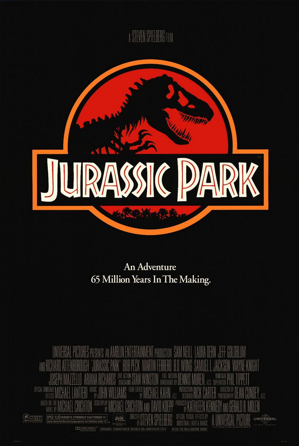
Being a movie poster, the obvious purpose of this image is to get people to see Jurassic Park. It’s intended for everybody old enough to see the film, but the poster is particularly aimed at those who have seen the trailer, either on TV or in the theater before some other movie. Since Jurassic Park is based on a book, it also reaches those people who read the book but weren’t aware that there was a movie coming out. So the goal of the poster is really to remind people that they want to see Jurassic Park, rather than entice people who haven’t heard of it. To that end, it focuses on creating a memorable icon—the easier it is to remember, the more likely people are to go see the film.
The poster uses a lot of contrast to create this memorable icon, both in the Jurassic Park logo and overall in the poster. The overall contrast is obvious: the white text and the yellow border stand out against the black background. The yellow also contrasts with the white text, and this along with the fact that the logo is the biggest element on the page makes this the clear focal point. There is also some font contrast here: all the credits are in the same thin, slightly darker font, which makes them easily ignored compared to the rest of the text. This is good because the credits are the least important part of the image. The title and subtitle also have different fonts. The title font looks exotic, hinting at adventure, while the subtitle font looks comparatively normal.
The distinct shape and coloring of the logo make it recognizable even at a distance, making it memorable. Within the logo, the red, yellow, white, and black all contrast with one another, creating distinct elements. The red inside the white lettering keeps the font looking interesting, and makes it the focus of the logo. This ensures that the single most memorable thing about the entire poster is the title of the film. The T-Rex silhouette will also be familiar to fans of the book, and placing it against a red background makes it stand out more than it does on the book cover. This familiar element in an otherwise new logo may help them connect the book to the film and make them more likely to see the film. The logo is also shown at the end of the theatrical trailer, so it brings the trailer to mind for those who have seen it, thus making them more likely to see the film, which is, after all, the point of the poster.

